
Go back to the main page
Go back to the Excel overview page
Files used on this page:
- anage_data.csv
- mouse_weight_data.csv
- chickweight.csv
- bubble_chart.csv
- dementia_patients_health_data.csv
Excel: Data Visualization
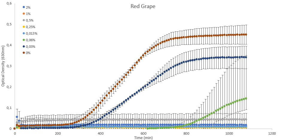 Figure 1: Data visualization of bacteria grown in the presence of anthocyanins isolated from red grapes.
Introduction
Though not as powerful as R or Python, Excel is a user friendly tool for data analysis and visualization. Regardless of the field you are working in, Excel can help you make sense of your data and present your findings in a clear and compelling way. By using Excel’s built-in charting features, you can easily create a variety of charts and graphs that visualize key trends and patterns in your data or correlations between different variables. With Excel, you can create professional-looking charts and graphs that are easy to understand and can help you communicate your insights to others. Excel offers a wide range of tools and capabilities that can help you make sense of your food-related data and present it in a way that is meaningful and informative.
Data visualization charts in Excel
Excel offers a wide variety of chart types, which can be customized to suit your data and presentation needs. Some of the most commonly used chart types in Excel include:
- Column charts: Used to compare values across different categories or to show changes over time.
- Line charts: Used to show trends over time or to compare trends between multiple data sets.
- Pie charts: Used to show how different categories contribute to a whole.
- Bar charts: Similar to column charts, but with horizontal bars instead of vertical columns.
- Scatter charts: Used to show the relationship between two variables.
- Area charts: Similar to line charts, but with the area between the line and the x-axis filled in.
- Radar charts: Used to compare multiple data sets across different categories.
- Surface charts: Used to show trends in three-dimensional data.
- Bubble charts: Similar to scatter charts, but with bubbles of different sizes to represent the data points.
These are just a few of the chart types available in Excel. With its robust set of charting features, Excel offers a wide range of options for visualizing your data and communicating your insights to others.
What makes a good chart?
A good chart is one that effectively communicates your data in a clear and concise manner. Here are some key characteristics of a good chart:
- Accuracy: The data in the chart should be accurate and clearly labeled. Any sources of error or uncertainty should be clearly indicated.
- Clarity: The chart should be easy to read and understand. The axes and labels should be clearly labeled (with units), and any legends or annotations should be concise and to the point.
- Simplicity: The chart should be simple and straightforward, avoiding unnecessary clutter or complexity (such as colored bars when they are not informative). The message of the chart should be clear and easily - understandable at a glance.
- Relevance: The chart should be relevant to the audience and the purpose of the presentation. It should highlight the key insights or trends in the data, and should be designed with the audience’s needs and interests in mind.
- Aesthetics: The chart should be visually appealing and professional-looking, with clear, readable fonts and colors that complement the data being presented.
By focusing on these key characteristics, you can create charts that effectively communicate your data and insights, and help you to make better-informed decisions based on your data.
Some chart examples
Column charts
Column charts are suitable for comparing values across different categories or for showing changes in data over time. They are a popular and effective way to visually represent categorical data, and are often used to display data in the form of vertical bars.
In Excel, charts with vertical bars are called column charts and bars with horizontal bars are called bar charts.
Column charts are particularly useful for:
- Comparing data: Column charts make it easy to compare data across different categories or groups, and to identify trends or patterns in the data.
- Showing changes over time: Column charts can be used to show changes in data over time, such as changes in sales or revenue from one year to the next.
- Highlighting differences: Column charts can be used to highlight differences between groups or categories, making it easy to see which values are larger or smaller than others.
- Displaying large amounts of data: Column charts can be used to display large amounts of data in a clear and concise manner, making it easy to interpret and analyze the data.
Overall, Column charts are a versatile and effective way to visualize categorical data and to communicate important insights and trends to others.
So let’s take the following dataset as an example: The AnAge Database of Animal Ageing and Longevity. It is a curated database of ageing and life history in animals, including extensive longevity records.
The csv file used in the examples below can also be downloaded here.
We are interested in the maximum age of different felines (species of cats). To select the relevant data, we first filter the Order for Carnivora and the Family for Felidae.
Note that as all Felidae are also carnivora, this is not strictly necessary.
In addition, the data was filtered for Data quality (acceptable and high).
Note: for some species no data is available for the maximum longevity (e.g. Kodkod, Marbeld Cat and Spanish Lynx). If you filter for data quality acceptable and high, these blanks will be filtered out.
Next, the data was alphabetically sorted for the common names.
The data sheet looks as follows:
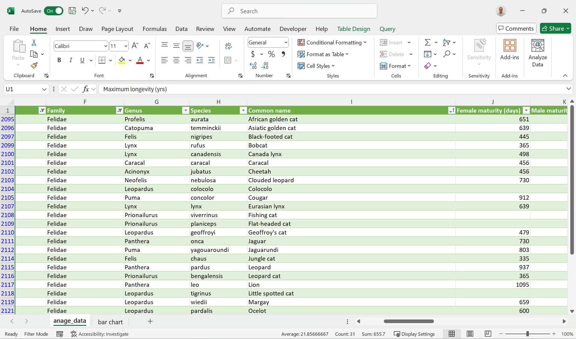 Figure 2: Data Sheet filtered for the Felidae.
Let’s first start with a Column chart for the maximum life span for the different Felidae:
If you need more help (each individual step explained), have a look here.
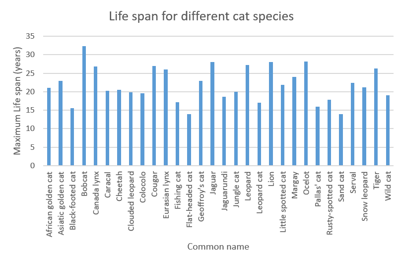 Figure 3: Column chart representing the maximum life span for different cat species.
Note that providing different colors for each different bar does not provide extra information. It will confuse the reader.
Note that the Bobcat has the highest maximum life span.
In a similar way, we can also create a bar chart for the adult body weight:
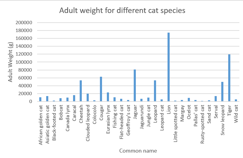 Figure 4: Column chart representing the adult weight for different cat species.
Not very surprising, the lion and tiger show the highest adult weights.
Now if you would like to compare this to the weight at birth, you could create a clustered column chart for this.
However, not every entry contains a Birth weight so we first deselect the blank rows using filters.
Next, we can create the clustered bar chart:
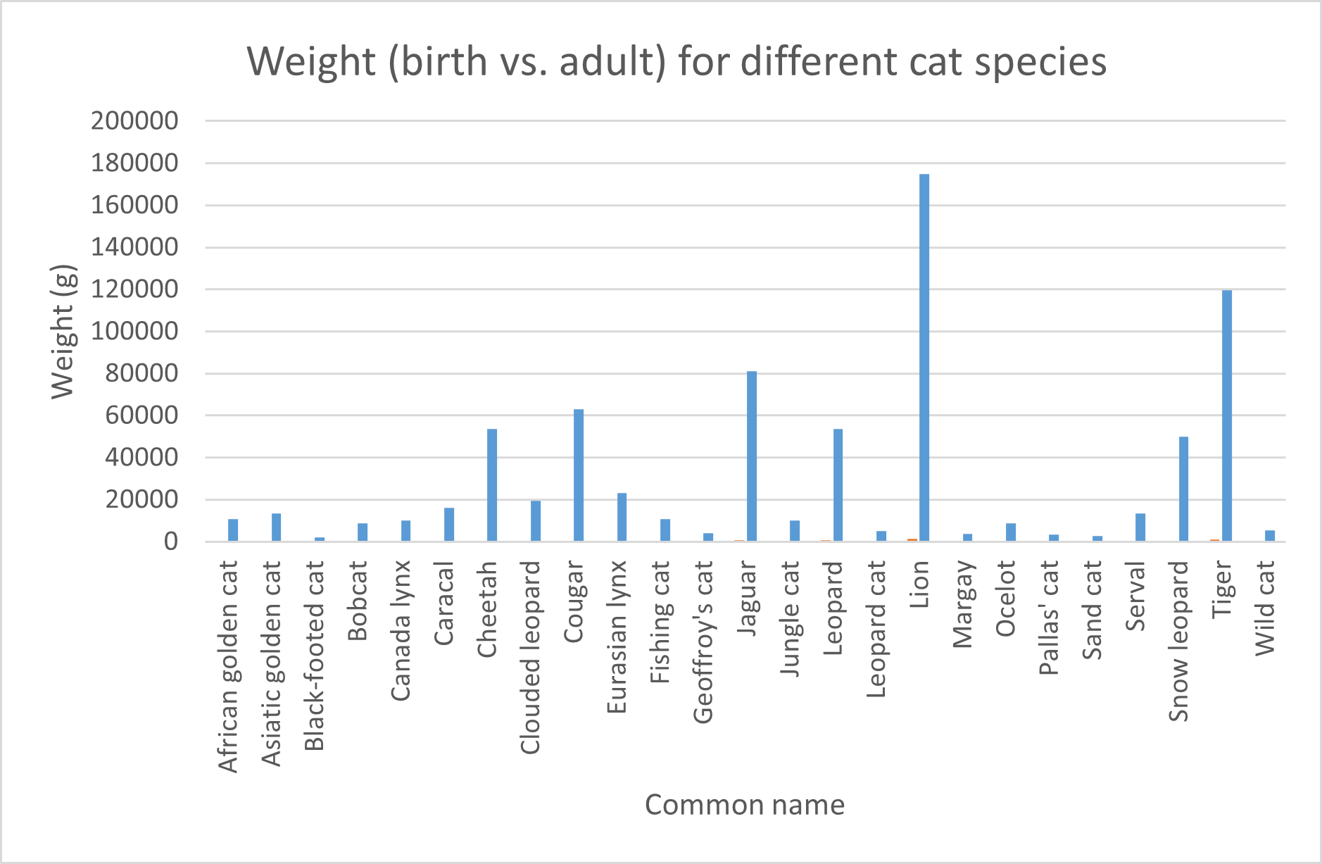 Figure 5: Clustered column chart representing the animal weight at birth and the adult weight for different cat species.
Note that providing different colors for each different set now does provide extra information. Thus, it is highly recommended in this case.
The problem with this chart is that the birth weights are barely visible. To improve this, we can use a logarithmic scale for the y-axis:
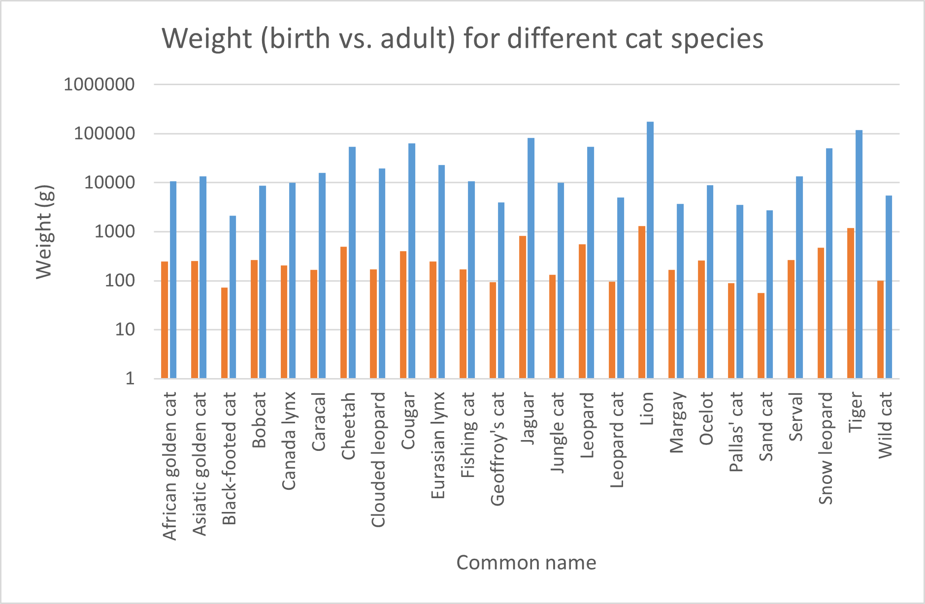 Figure 6: Clustered column chart representing the animal weight at birth and the adult weight for different cat species. logarithmic scale.
Note: if the order of birth weight and adult weight are swapped in your case, you can change the order by right clicking your chart, click
Select Data...and use the arrows to change the order of the data series.
You could use a stacked column chart to have it all in one overview:
 Figure 7: Stacked column chart representing the animal weight at birth and the adult weight for different cat species. logarithmic scale.
But how do these birth weights relate relatively to the adult weights? We could calculate this but Excel provides a plot type that takes this work out of your hands:
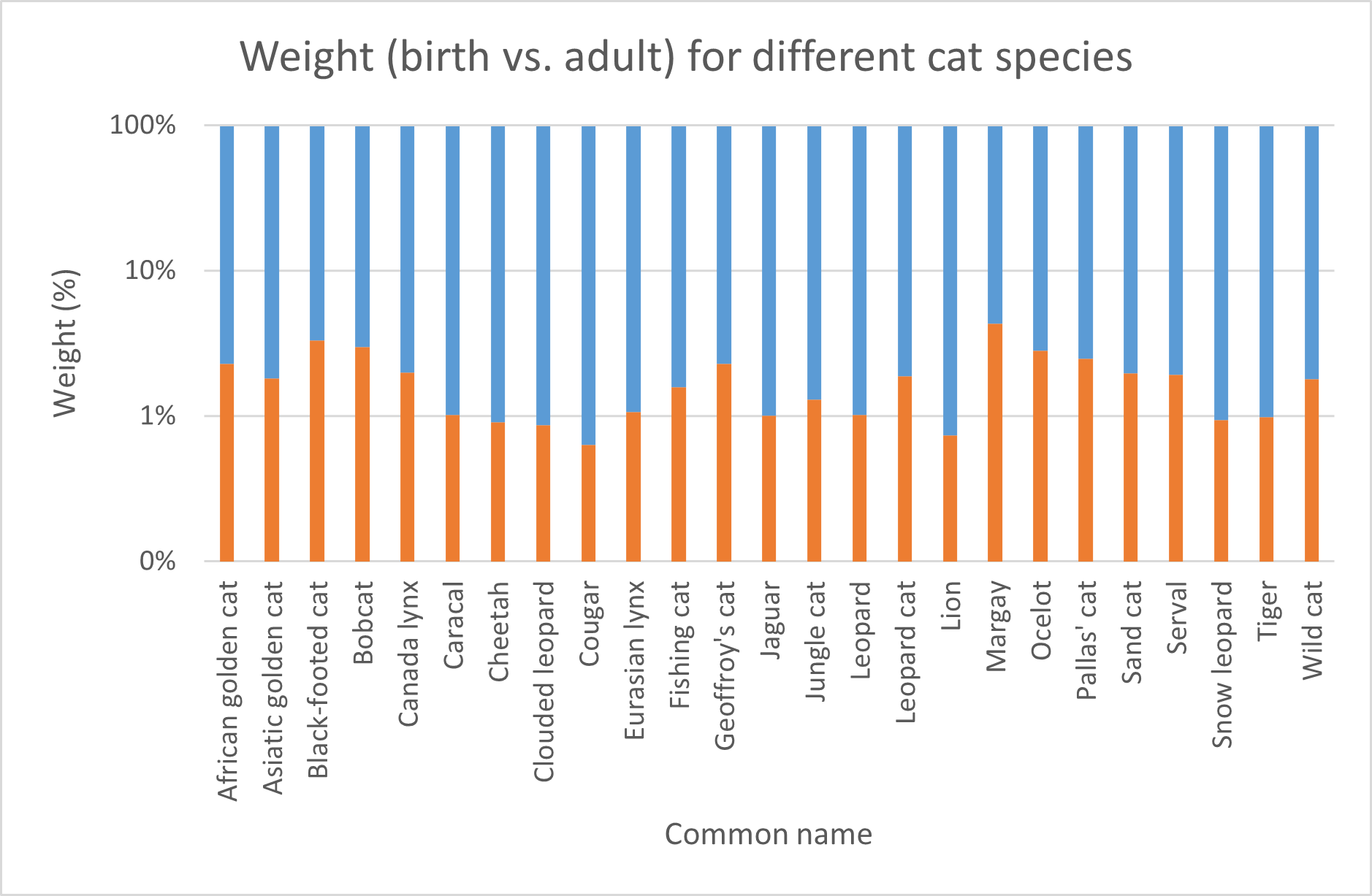 Figure 8: Relative stacked column chart representing the relative animal weight at birth and the adult weight for different cat species. logarithmic scale.
You will see that the axis labels are initially positioned at the top of the chart. You can change this by right clicking a y-axis label, then click
Format Axis...>Labelsand selectLowfrom the dropdown underLabel Position.
Like the relative stacked column chart, the pie chart is another chart type that is suitable for such a representation.
Pie Chart
Pie charts are suitable for displaying data that can be broken down into categories or parts that add up to a whole. They are often used to show proportions or percentages of a whole.
Pie charts are effective for conveying information quickly and intuitively, as the size of each slice corresponds to its percentage of the whole. They are also useful for highlighting the relative sizes of each category or part, making it easy to compare them at a glance.
However, pie charts may not be the best choice for all types of data. For example, they can become difficult to read when there are too many categories or when the differences between the sizes of the slices are small. In these cases, a bar chart or other visualization (Pie of Pie) may be more appropriate.
We take our previous example as an example to create a pie chart. The problem is that there are too many categories. Therefore, we will narrow down the number of rows by focussing on big cats. According to Wikipedia The term “big cat” is typically used to refer to any of the five living members of the genus Panthera, namely the tiger, lion, jaguar, leopard, and snow leopard, as well as the non-pantherine cheetah and cougar.
Big cats’ food intake is relative to their body mass. Thus, the knowledge of big cats’ food intake relative to their body mass is a fundamental principle used by zoos and wildlife sanctuaries to plan and manage their animals’ diets. However, in reality, it’s a bit more complex than just a simple percentage. but for the sake of the exercise, we will plot the relative body mass of the big cats to make an estimation of their relative food intake. This can be visualized in a Pie chart.
So we select these species first and then create the Pie Chart:
 Figure 9: Pie chart representing the relative weight of big cats in grams
Or with the data labels as percentages shown connected to the pie slices (choose: chart design > chart elements > Data labels > Outside End):
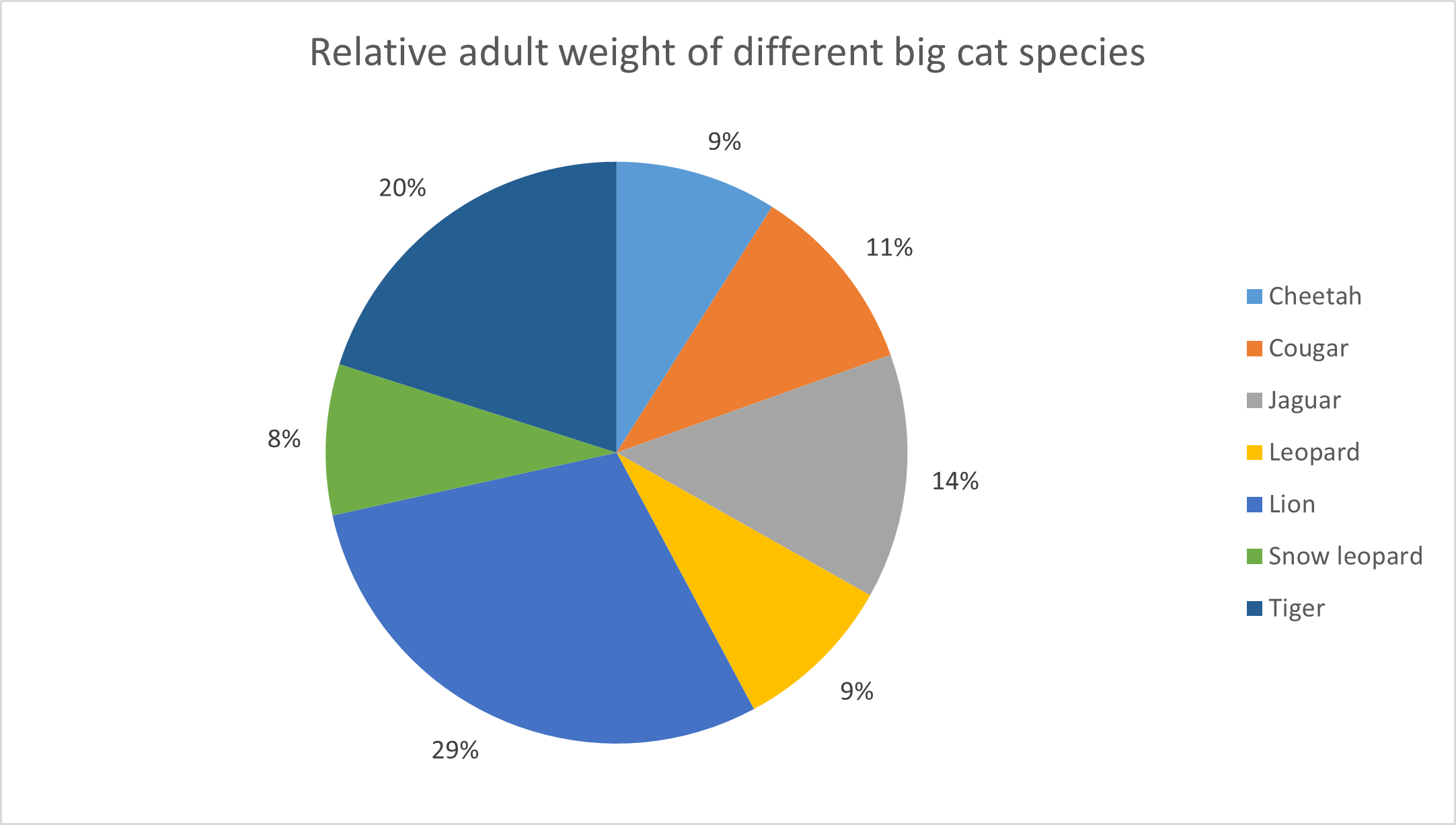 Figure 10: Pie chart representing the relative weight of big cats in grams. Data labels as percentages are connected to the pie slices.
Pie of Pie
Pie of Pie charts can become handy if the individual slices become small and the Pie chart becomes cluttered.
Here is an example of a Pie of Pie chart with all the Feline species:
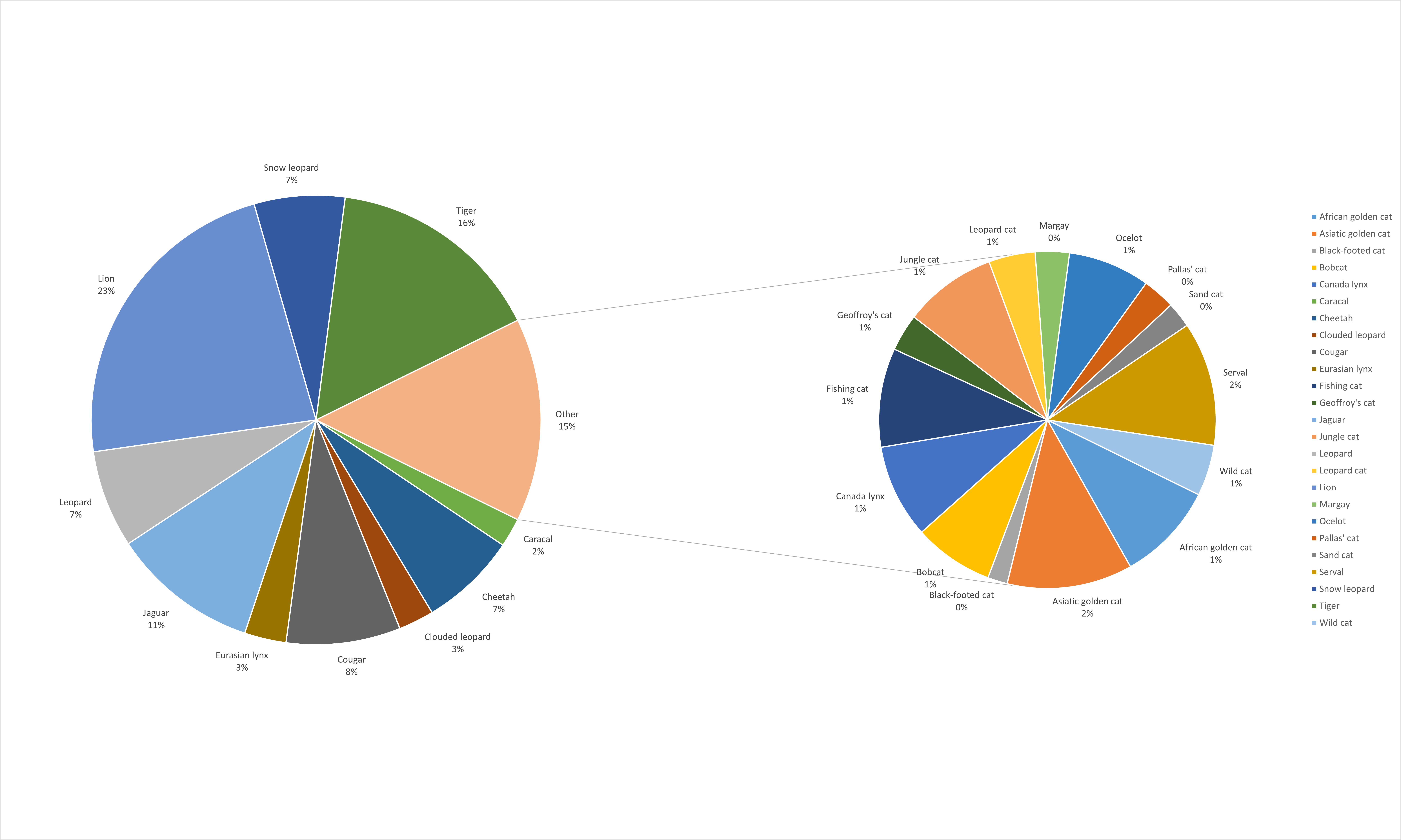 Figure 11: Pie of Pie chart representing the relative weight of cats in %. Data labels and percentages are connected to the pie slices.
As you can see, the second Pie is created from the smallest Pie slices from the first Pie chart. This creates less clutter when the individual slices become to small.
You can format the secondary Pie by right-clicking it > Format Data Series and then use the drop down to select the appropriate Split Series.
Radar charts
A radar chart, also known as a spider chart or a star chart, is a graphical representation of data in which values are plotted along a set of axes that radiate from a central point. Each axis represents a different variable, and the data points are connected to form a polygon shape, which can be filled in with color to represent the area covered by the data.
Radar charts are often used to compare multiple variables or data sets, particularly when the values have different units or scales.
Let’s view some (imaginary) protein quantification data for 5 different protein quantification methods (Lowry, Bradford, BCA, UV/VIS and Kjeldahl). These data show the concentration of protein in mg/L. We have these data from three different protein samples.
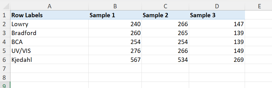 Figure 12: Data suitable for a radar chart. Protein quantification data for different methods and different samples compared.
The resulting radar chart is shown below:
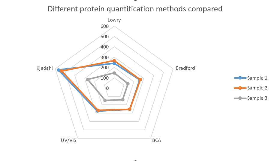 Figure 13: Radar chart created from the previous data set. Protein quantification data for different methods and different samples compared.
Note that we can conclude that the Kjedahl method shows considerable higher amounts. Although the protein concentration in sample 3 is lower compared to the other two samples, the same pattern can be seen. The Kjeldahl method seems to overestimate the protein concentration.
Box plots
A box plot, also known as a box and whisker plot, is a graphical representation of a dataset that shows the distribution of the data through its quartiles, outliers and extremes. It is called a box plot because it uses a box to represent the second and third quartiles (the inter-quartile range or IQR), and lines to represent the first and fourth quartiles (the lowest and highest data points within the IQR), as well as the outliers, if any.
Box plots are useful for visualizing the distribution and spread of data, as well as for identifying potential outliers. They can also be used to compare the distribution of data between different groups or datasets. Box plots are particularly useful when the data is non-parametric (not normally distributed) or when the distribution is skewed or multi-modal.
Overall, box plots are a useful tool for summarizing and visualizing complex data sets, and for providing insights into the distribution of data and potential outliers.
Let’s have a look at the following dataset:
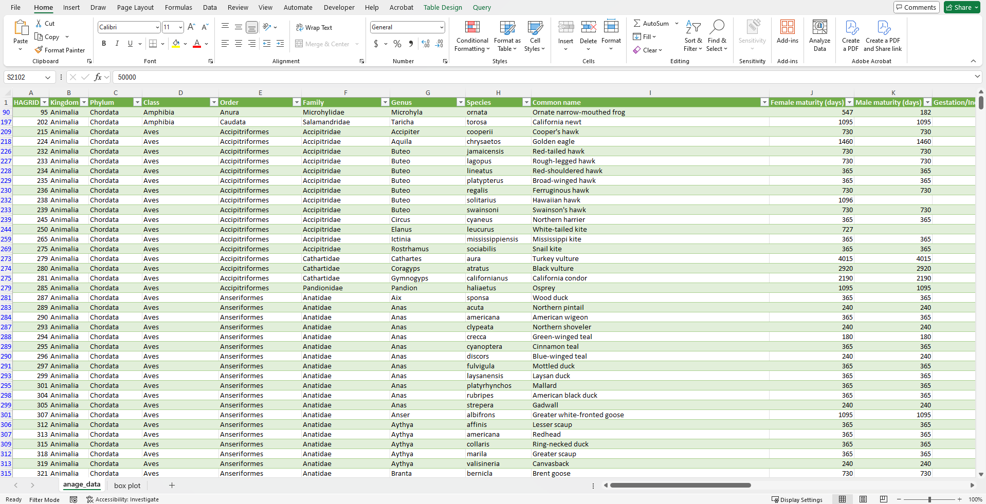 Figure 14: Data about life span in different animal species.
And now we can compare the maximum life span between different orders in mammals.
First we filter our data for mammals (filter for Class Mammalia). For the categories, we will use all the rows for the column order (such as afrosoricida that is an order of placental mammals. Members of this order are called afrosoricids, and include golden moles, otter shrews, and tenrecs).
The questions that can be asked are:
- What is the median value per category?
- What are the minimum and maximum values per category?
- What are the 25% and 75% percentile values per category?
- Are there any outliers?
A box plot will answer all these questions at once:
We choose the columns Maximum longevity (yrs) for the series. The column order is selected as labels. See the result below.
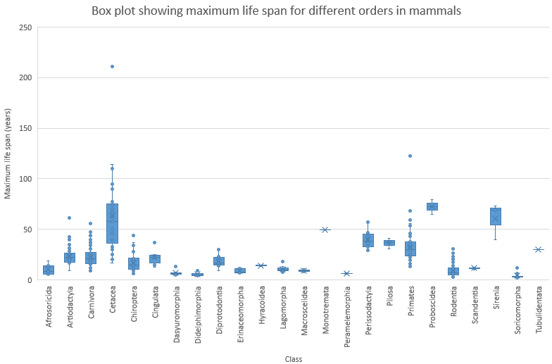 Figure 15: Box plot about maximum life span for different orders of mammals.
From this plot, we can conclude that Proboscidea are an order of mammals that live long and have a narrow variation of maximum lifespan. Proboscidea is a taxonomic order of afrotherian mammals that includes all species of elephants.
In addition, Cetacea (whales, dolphins and porpoises) also tend to live long but their is a wide variation in maximum life span. The same holds for Sirenia (sea cows).
You can also find an outlier in the order of primates. You might already have an idea which species that is…
The largest living mammal in the data set is an outlier in the order Cetacea. Can you identify the species?
The above picture is the standard layout of the box plot in Excel. However, you could argue that it would be better to tweak some things in the plot. First of all, the mean is shown as a cross. Box plots are often used in combination with nonparametric statistics and quantile (including median) values are much more appropriate to use. In addition, inner points are visible and we can not discriminate them from outliers. We will also use the inclusive method to calculate the quantiles. This is the more common method used and also used by ggplot2 in R. Because the inclusive method is a widely accepted standard and the default for many programs, it’s generally the best choice for all your data, regardless of sample size. We can tweak this (select the series and choose: Format Data Series) accordingly. See the result below:
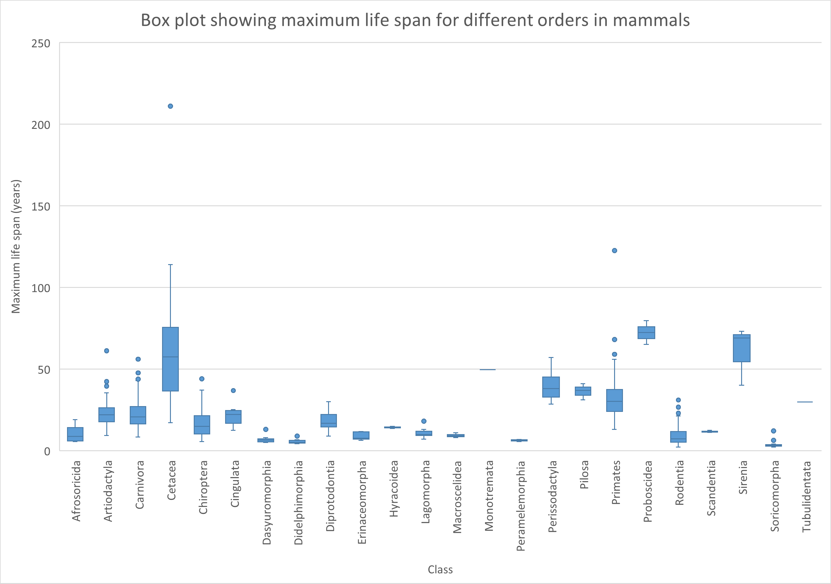 Figure 16: Tweaked box plot about maximum life span for different orders of mammals.
Of course you can also choose to omit the outliers in de plot. Select the series and choose: Format Data Series.Deselect the Show outlier points checkbox.
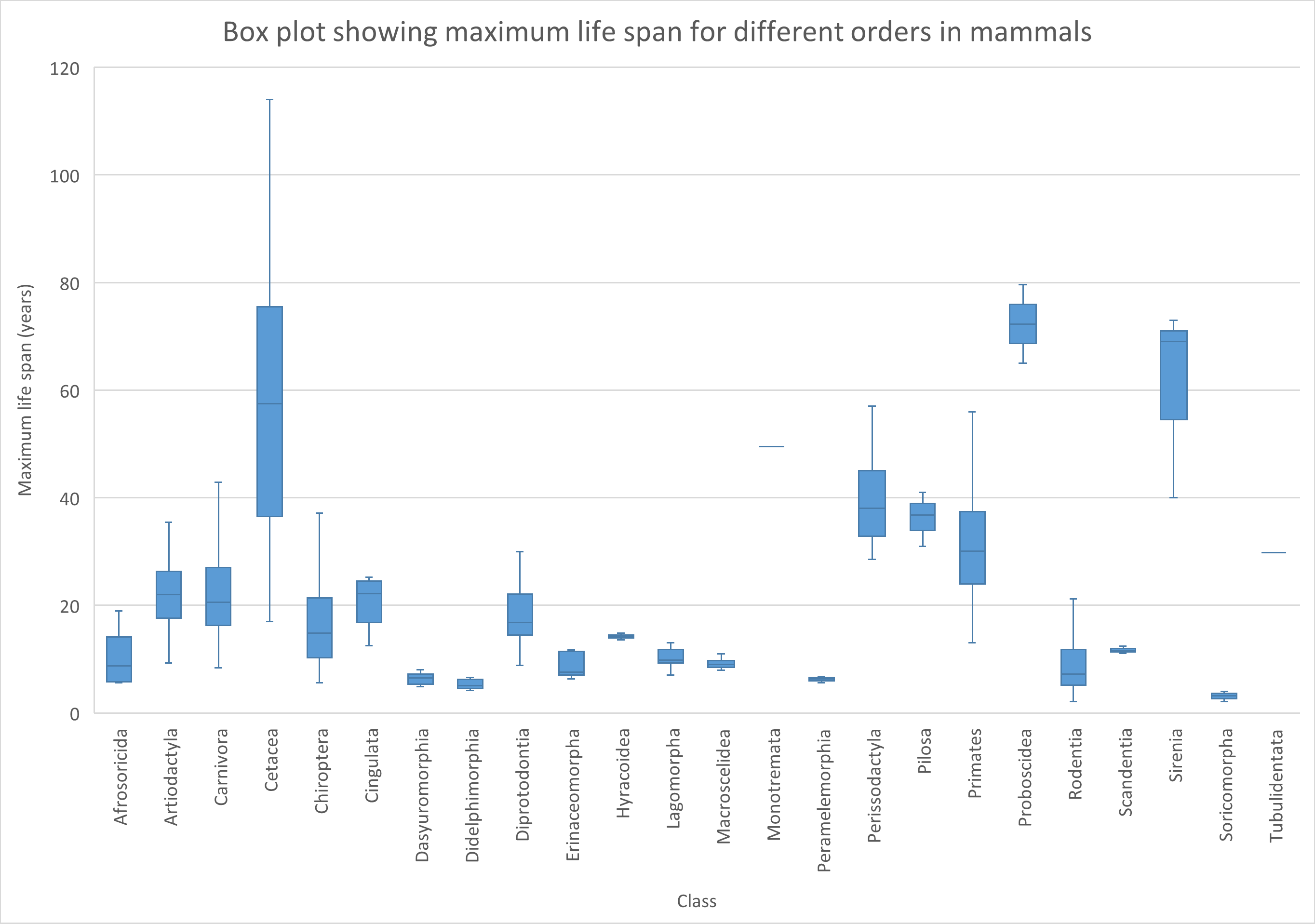 Figure 17: Tweaked box plot about maximum life span for different orders of mammals. Note that outliers are now omitted.
We can also create box plots with more data series. In the example below, days to reach maturity between females and males is compared for different orders of mammals.
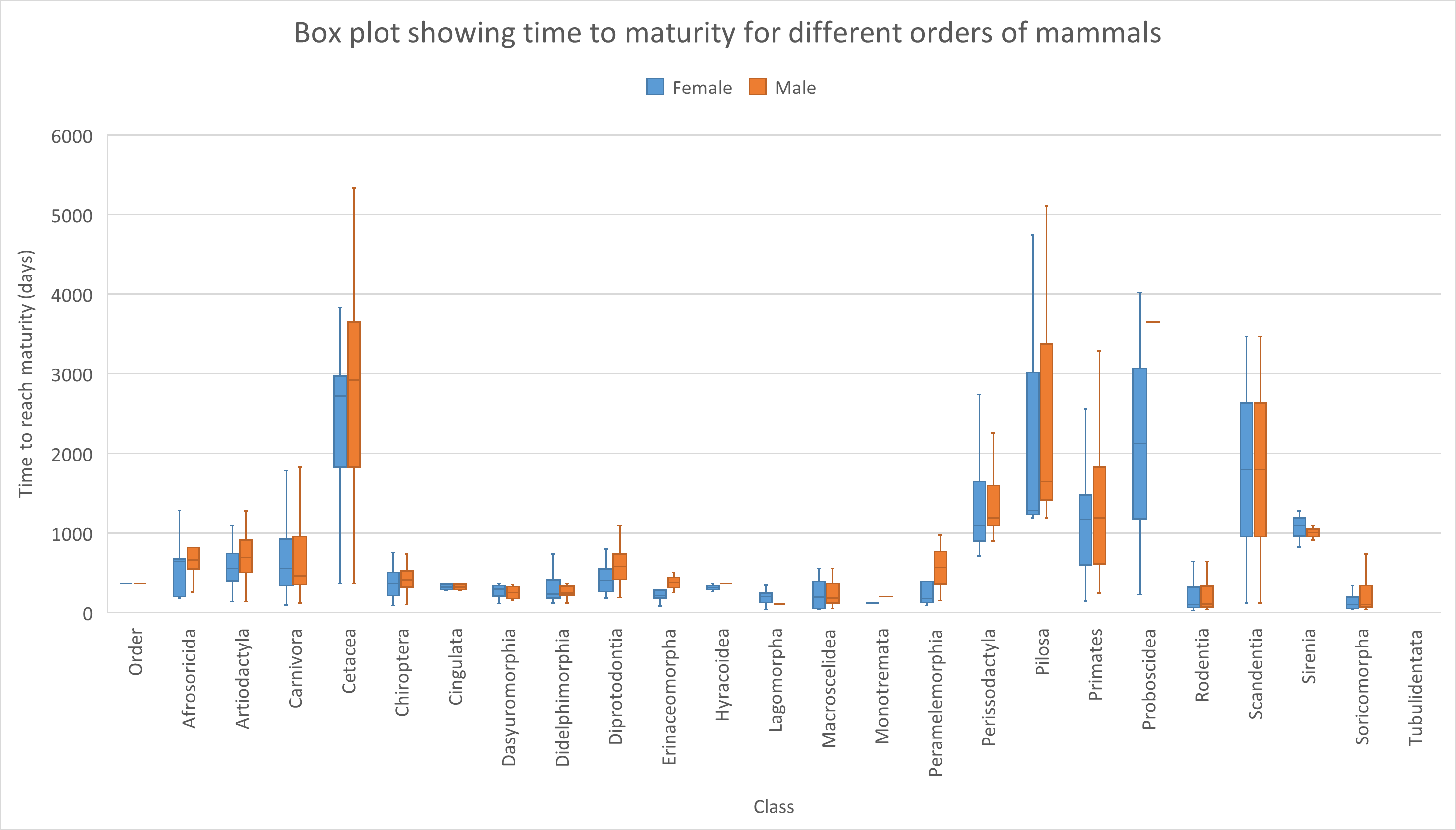 Figure 18: Tweaked box plot comparing the time to reach maturity between females and males of different orders of mammals. Note that outliers are omitted.
You might have noticed that for some orders, no clear Tukey box shape is seen (minimum, lower percentile, median, higher percentile and maximum). This is because some orders only contain one or two data points (animal species). You can omit these by filtering of course. Or (even better) try to obtain a more complete data set.
Line and XY-scatter plots
Line charts are useful when you want to visualize trends or changes in data over time or another continuous variable. They are particularly good for showing how a particular variable changes over time or in response to another variable. For example, a line chart can be used to show how the weight of mice has changed over time.
On the other hand, XY scatter plots are useful when you want to visualize the relationship between two variables. They are particularly useful for showing the degree of correlation between two variables or identifying outliers in the data. For example, a scatter plot can be used to show the relationship between a person’s height and weight.
In summary, line charts are best used when you want to show trends or changes over time, while XY scatter plots are best used when you want to visualize the relationship between two variables.
In the example below, we will investigate the gain of weight between 3 different strains of mice. We will compare the weight during 1 year of wild-type, ob/ob mice and db/db mice. Both ob/ob and db/db mice are disturbed in leptin signaling. Leptin is a hormone produced by fat cells that helps regulate appetite and energy expenditure. The ob/ob or obese mouse is a mouse strain that has a mutation in the gene responsible for the production of leptin. It produces a truncated variant of the leptin protein. The db/db mice have mutations in the leptin receptor. Both strains eat excessively and are used as an animal model of type II diabetes.
The data used for this example are fictive and generated by a script.
 Figure 19: The ob/ob or obese mouse is a mouse strain that eats excessively due to mutations in the gene responsible for the production of leptin. It is used as an animal model of type II diabetes. Source: https://en.wikipedia.org/wiki/Ob/ob_mouse#/media/File:Fatmouse.jpg.
The data is as follows:
It can be downloaded here.
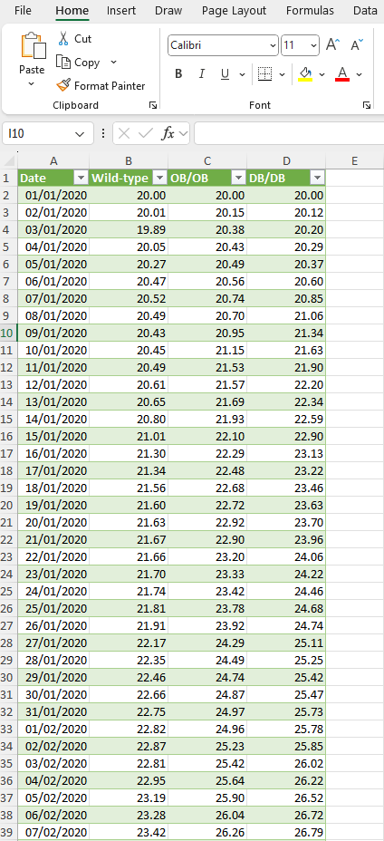 Figure 19: Fictive data for weight gain for three different mouse strains over the course of 1 year.
The corresponding line plot looks as follows:
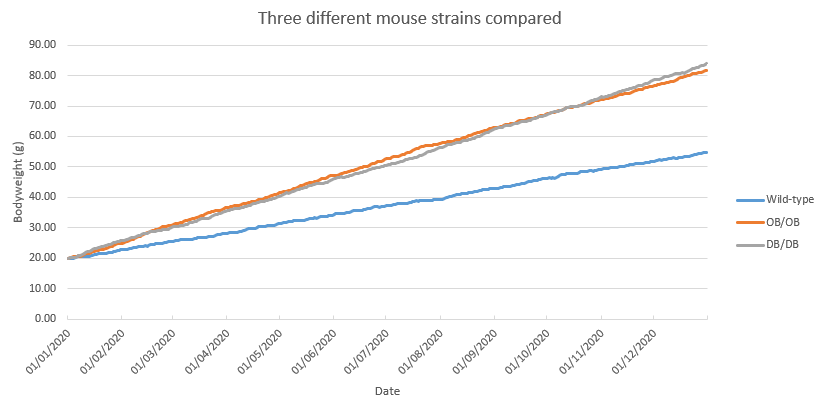 Figure 20: Line plot of fictive data for weight gain for three different mouse strains over the course of 1 year.
As you can see, both ob/ob as well as db/db mice gain considerably more weight as compared to wild-type mice.
Of course, one should take into account that only three mice are included in this measurement. It would be better to follow the weight gain for multiple subjects for each genotype.
Realize that a line chart is only plotted well if the data points are inter-spaced evenly.
Consider the following mini dataset:
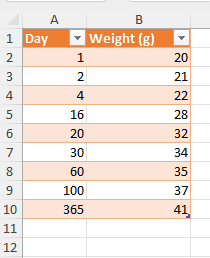 Figure 21: Dietary intervention for 365 days.
As you can see, the data points for x are not evenly distributed. Plotting this with a line plot will go wrong:
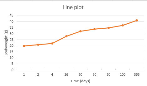 Figure 22: Line plot for body weight gain in 365 days.
As you can see, the data points on the x-axis are just labels and do not correspond to their actual value. Thats why we need an XY-scatter plot for this purpose:
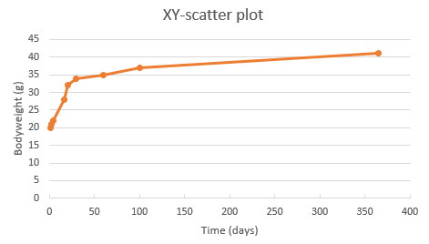 Figure 23: XY-scatter plot for body weight gain in 365 days.
As you can see from the above chart, the data on the x-axis are now separated according to their value.
To show the use of an XY-scatter plot to visualize a correlation, the ChickWeight dataset from R was used. The weight column represents the body weight of chickens (g). The time column represents the number of days since birth when the measurement was made.
You can download the csv file here.
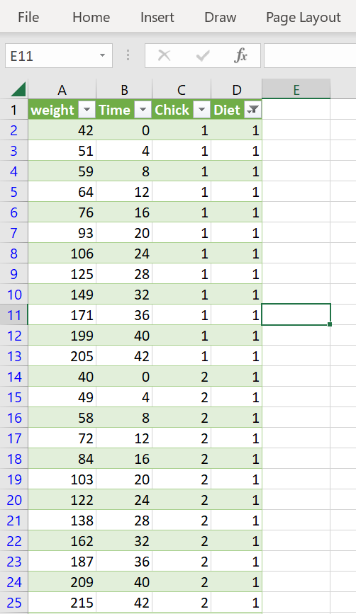 Figure 24: Chicken weight data set. Dataset was filtered for Diet 1
The data of all chickens from diet 1 plotted as XY-scatter: A linear regression model was added as trendline and the equation is shown on the chart (together with the r^2 value).
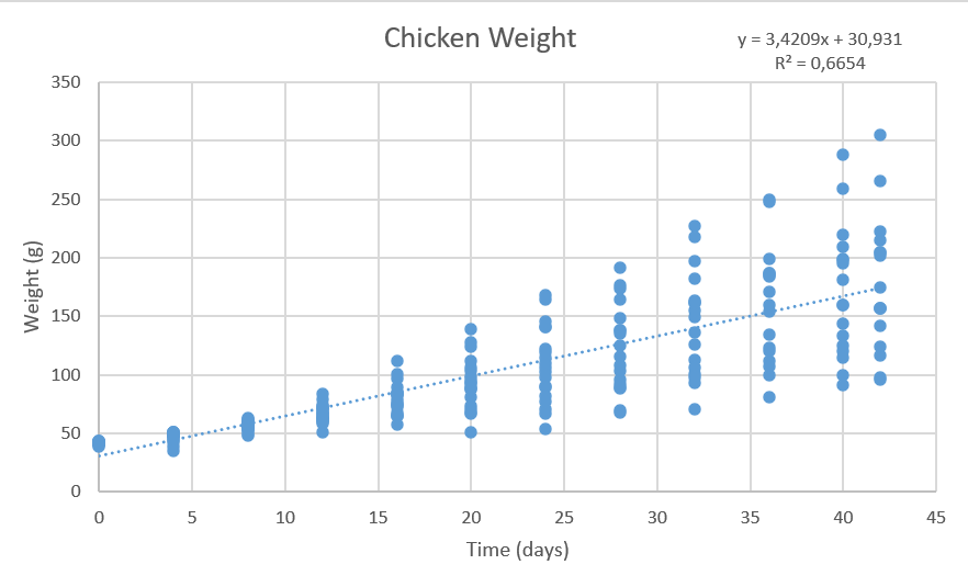 Figure 25: Chicken weight data set plotted as XY-scatter. Dataset was filtered for Diet 1
Bubble chart
If you have data that is most suitable to present in a XY-grid but you have an extra dimension, bubble charts might be a good chart type.
Bubble charts are a great way to display data that includes three variables. In the context of a laboratory, here is an example of a dataset that could be presented in a bubble chart:
Suppose you have collected data on the protein concentration for different analysis methods. In addition, you have also measured the analysis time for each method and the analysis volume (number of assays per day).
To display this data in a bubble chart, you could use the following format:
- X-axis: Analysis time (minutes)
- Y-axis: Protein concentration (mg/mL)
- Bubble size: Represents the number of assays per day in the laboratory.
By using a bubble chart to display this data, you can quickly see patterns and trends among the different types of protein quantification methods, the required analysis time as well as their number of analysis per day.
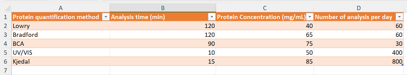 Figure 26: data set suitable to display in a bubble chart. Note that these are fictive data.
The data can be downloaded here.
Below is a bubble chart of this dataset:
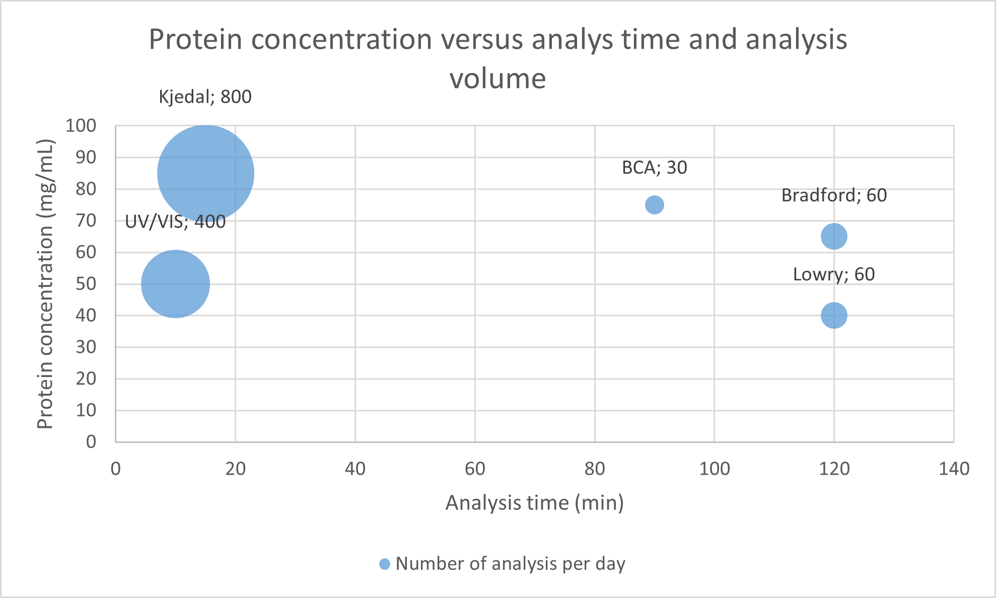 Figure 27: Bubble chart of protein quantification methods. Note that the bubble size (and the numbers in the labels) represents the number of analysis per day.
The Chart includes the following:
- X-axis: Analysis time (minutes)
- Y-axis: Protein concentration (mg/mL)
- Bubble size: Represents the number of assays per day in the laboratory.
The chart was tweaked as follows:
- x-axis bounds were set for 0 as minimum
- data labels were added: Bubble Size to show the number of analysis per day.
- data labels were added: Value From Cells, protein quantification methods selected
- Label Position was changed:
Aboveselected.
An extra dimension could be included by using colors. For example you could add categorical data (ordinal data in this case) such as sensitivity to chemical interferences like sugars and detergents, which Lowry and Bradford are very susceptible to (in red), but the other methods are less so (in green).
Pivot charts
In the data analysis section, we have seen the use of pivot tables. Pivot tables come in handy to analyze data quickly and in an organized manner. We can use pivot charts to directly visualize the data from pivot tables.
We will use the example from the data analysis section to create a pivot chart.
Here is a recap from the dataset used:
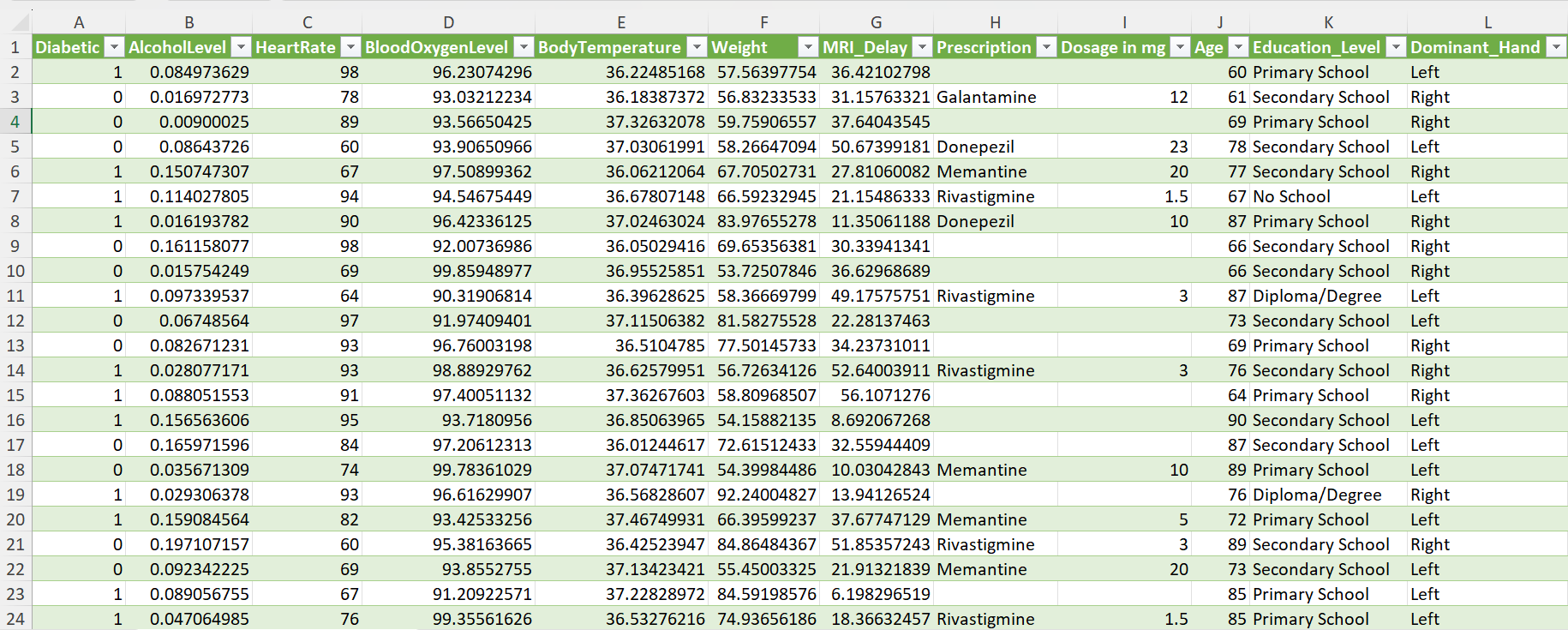 Figure 28: Dementia Patient Health,Prescriptions ML Dataset.
You can download the data here.
Suppose we want to investigate if there are differences in the average heart rate between activities (mild, moderate, sedentary). The corresponding pivot table is as follows:
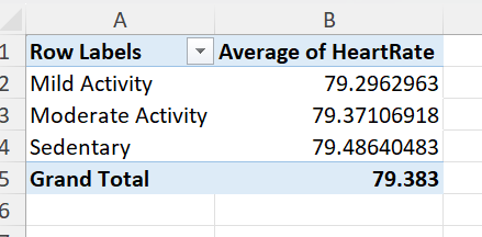 Figure 29: Pivot table showing the average heart rate for different Physical Activity categories.
So first we choose pivot chart from the ribbon (insert>PivotChart) and select the data source (all the data) as well as the sheet for the output data:
 Figure 30: Data source and the output sheet selected.
Next, we select the correct fields (Physical_Activity and HeartRate) and the calculations on the data (we use average for the heart rate in this example).
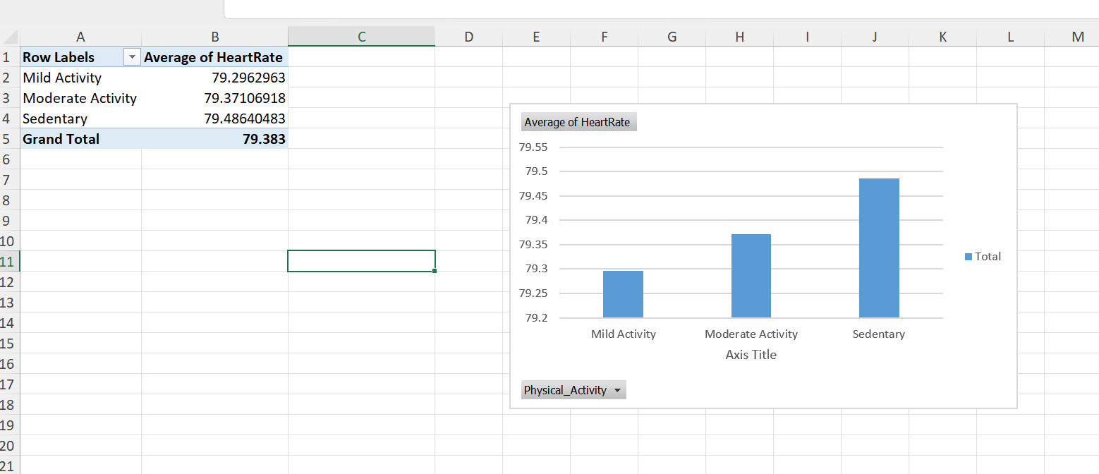 Figure 31: Select the correct fields and calculation types.
This results in the following chart.
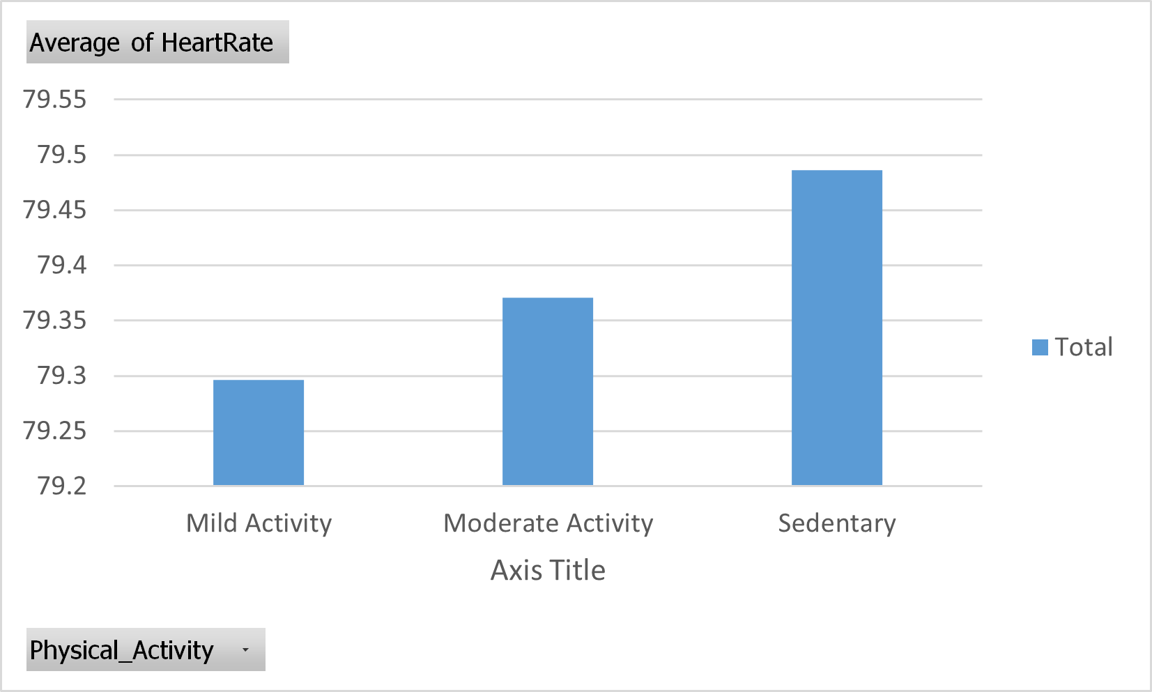 Figure 32: Pivot chart. Average of Heart rate from different Physical activity categories.
Note that you can dynamically select or unselect specific categories. We can for example deselect Moderate Activity:
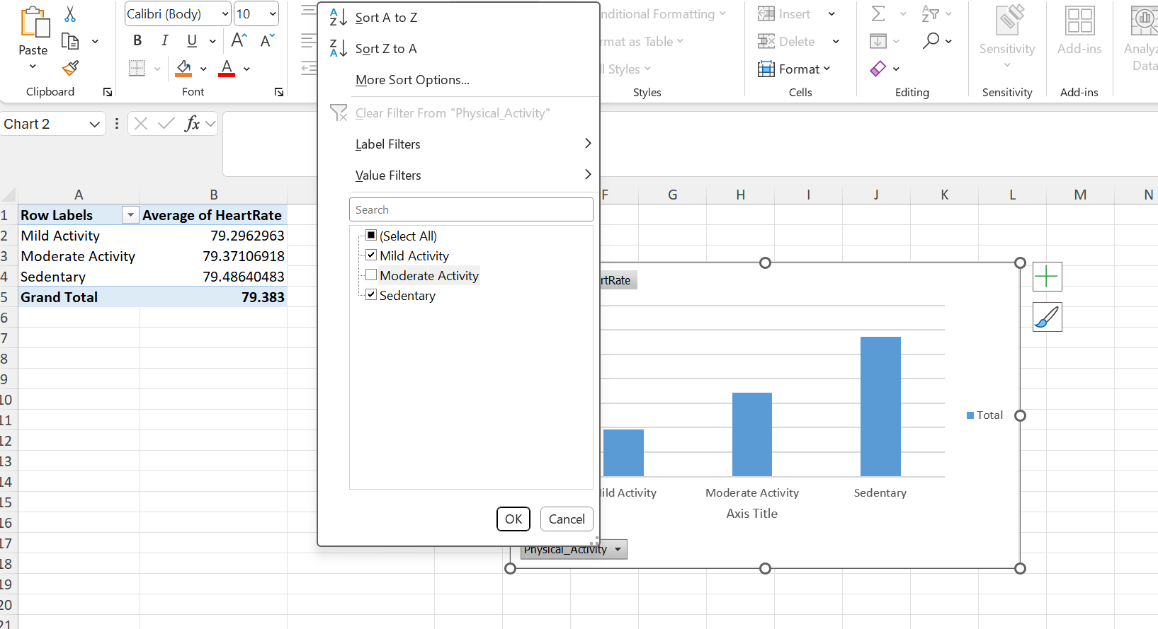 Figure 33: Pivot chart. Average of Heart rate from different Physical activity categories. Moderate Activity deselected.
The result of the pivot chart (Moderate Activity deselected):
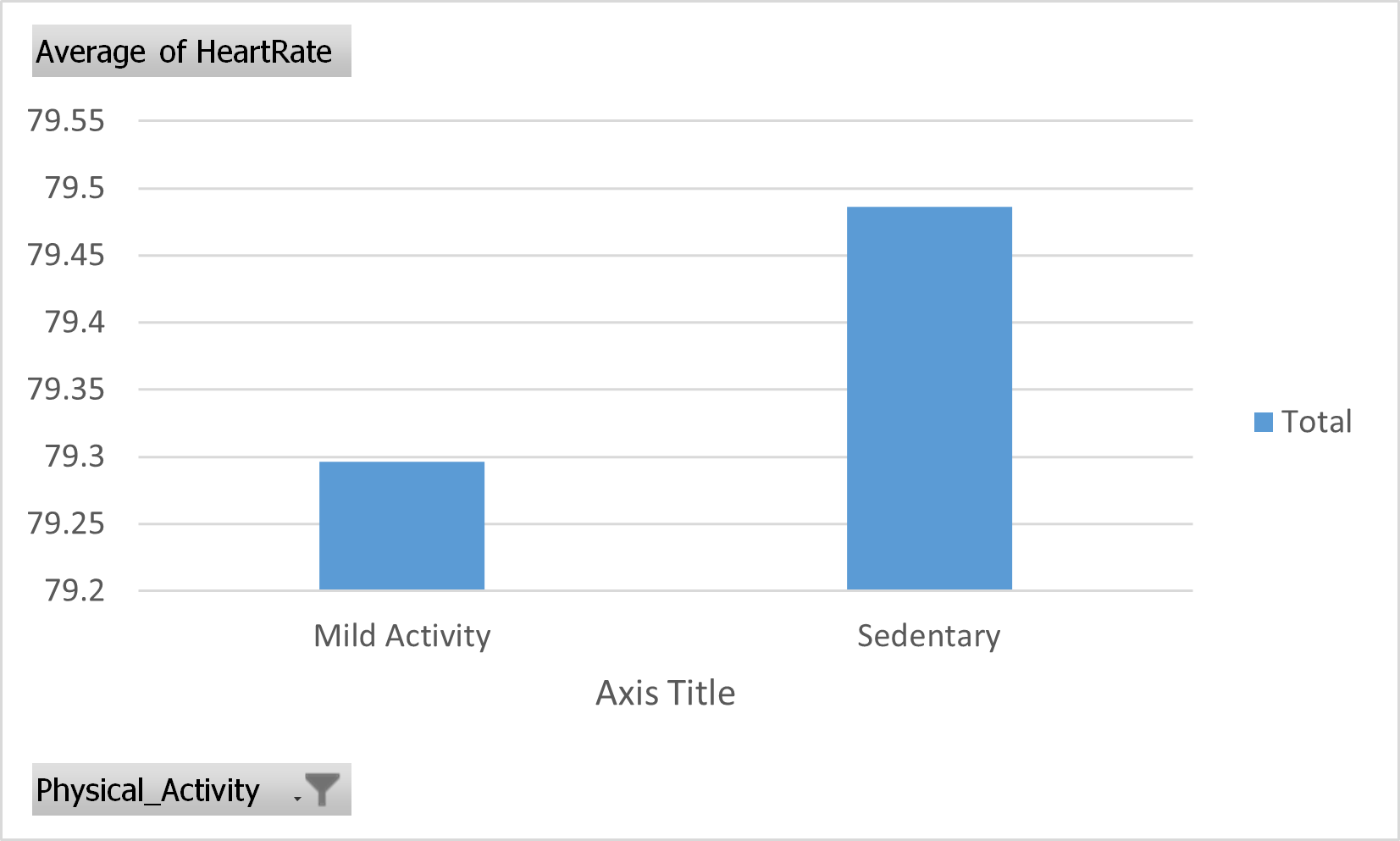 Figure 34: Pivot chart. Average of Heart rate from different Physical activity categories. Moderate Activity deselected.
Note that the y-axis does not contain proper labels with quantities and units. While this is OK for investigative analysis, publication quality charts should always have proper y-axis labels with quantities and units specified.
So we select moderate activity again and add a proper graph title and axis labels:
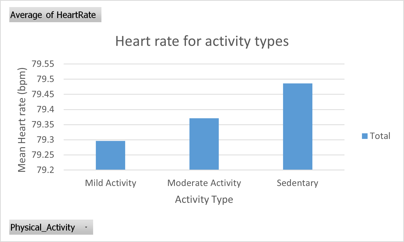 Figure 35: Pivot chart. Average of Heart rate from different Physical activity categories. Chart title and axis labels added.
You can also plot the median heart rate using Power Pivot. Follow the steps from the Data Analysis section describing Power Pivot.
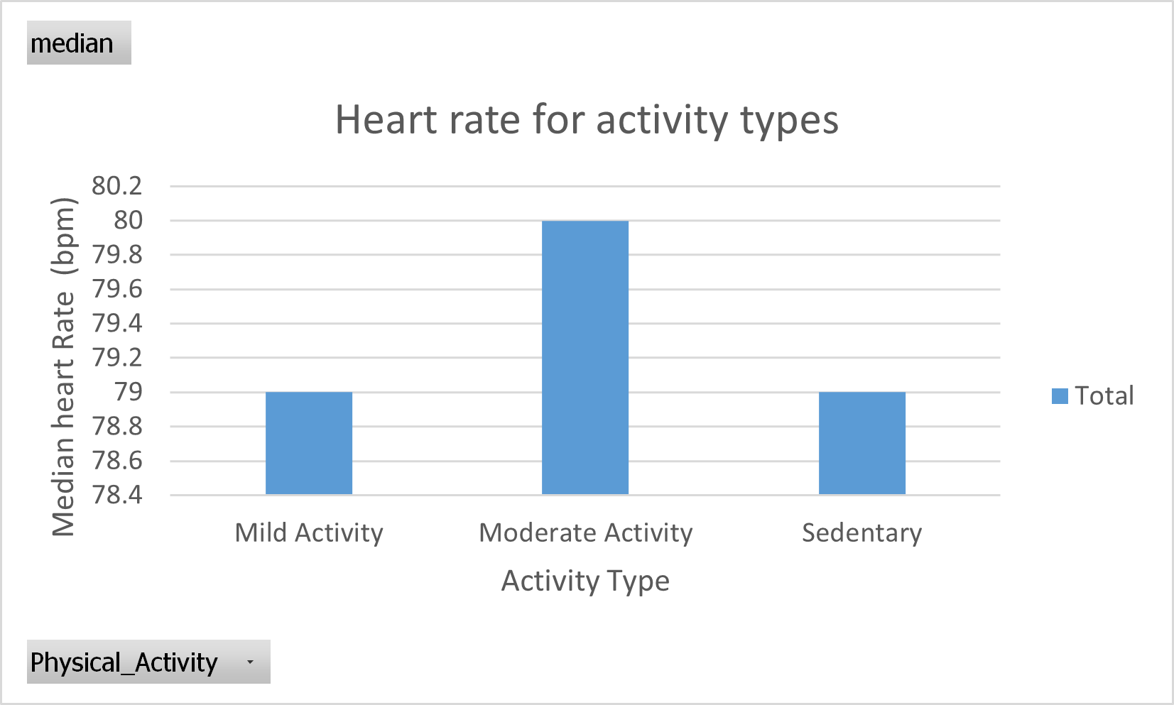 Figure 36: Power Pivot chart. Median of Heart rate from different Physical activity categories. Chart title and axis labels added.
Go back to the main page
Go back to the Excel overview page
⬆️ Back to Top
This web page is distributed under the terms of the Creative Commons Attribution License which permits unrestricted use, distribution, and reproduction in any medium, provided the original author and source are credited. Creative Commons License: CC BY-SA 4.0.